Problem:
The original website lacked visual warmth, had inconsistent branding, overly dense menu layouts, and forms that were difficult to use.
Users needed a clearer navigation structure and a more welcoming aesthetic.
Goals:
Create a warm, welcoming experience aligned with the café’s brand
Simplify navigation and improve menu readability
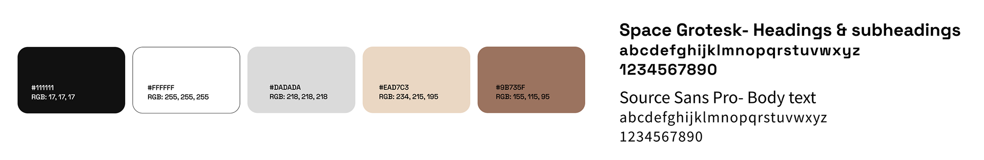
Add a cohesive visual identity
Improve usability for mobile and desktop
Make forms more intuitive and accessible
Personas
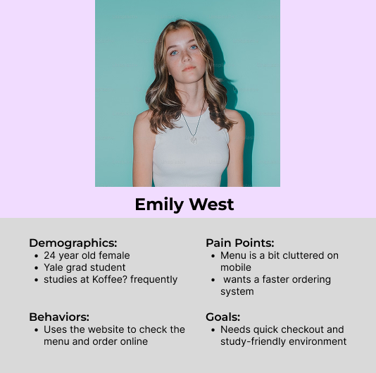
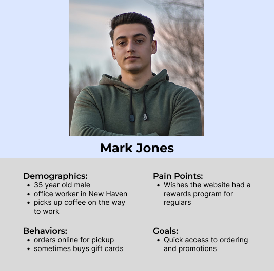
User personas were created to understand the needs and frustrations of Koffee?’s customers. These insights informed improvements to the menu layout, rewards system, and overall site usability.
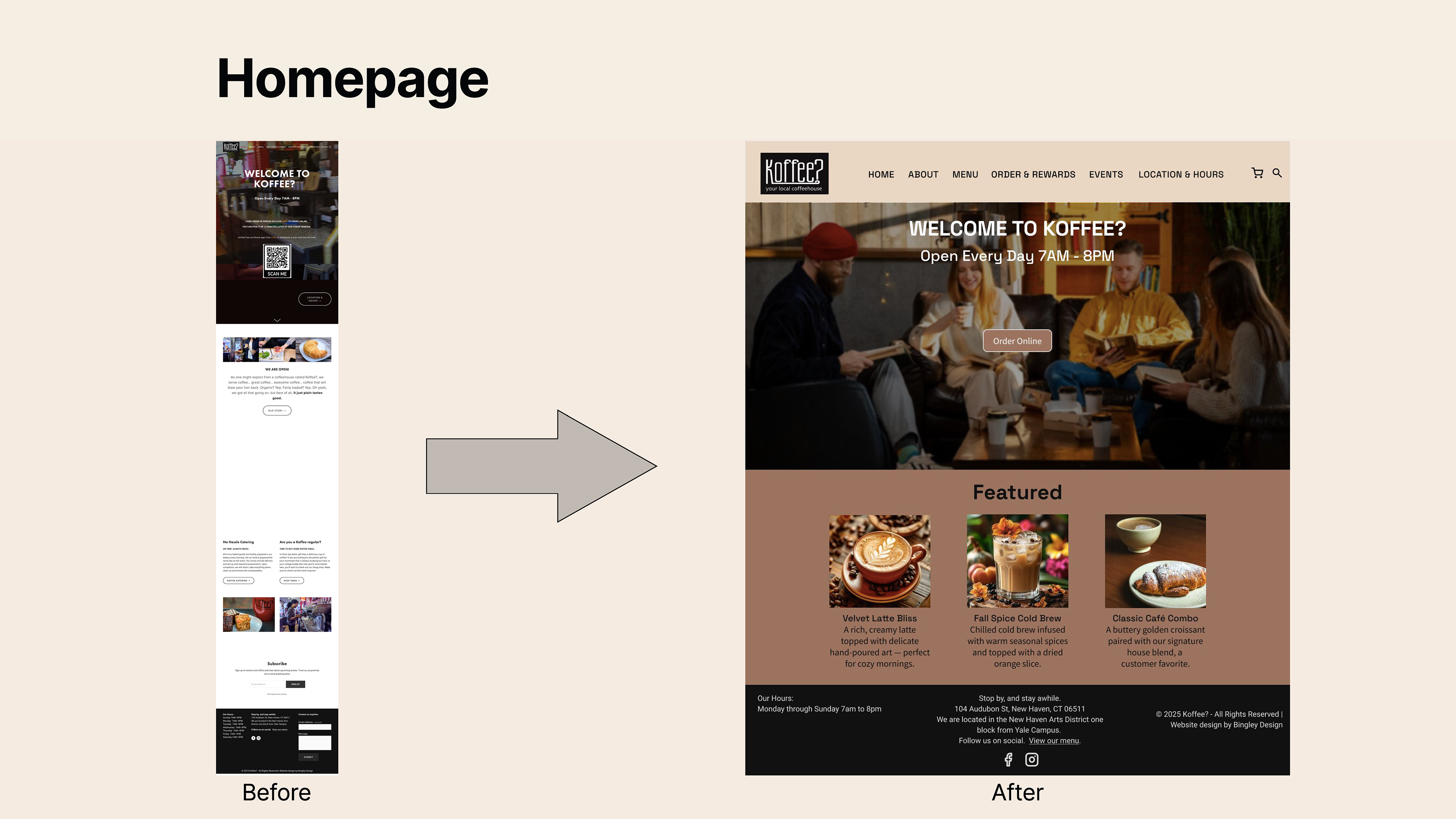
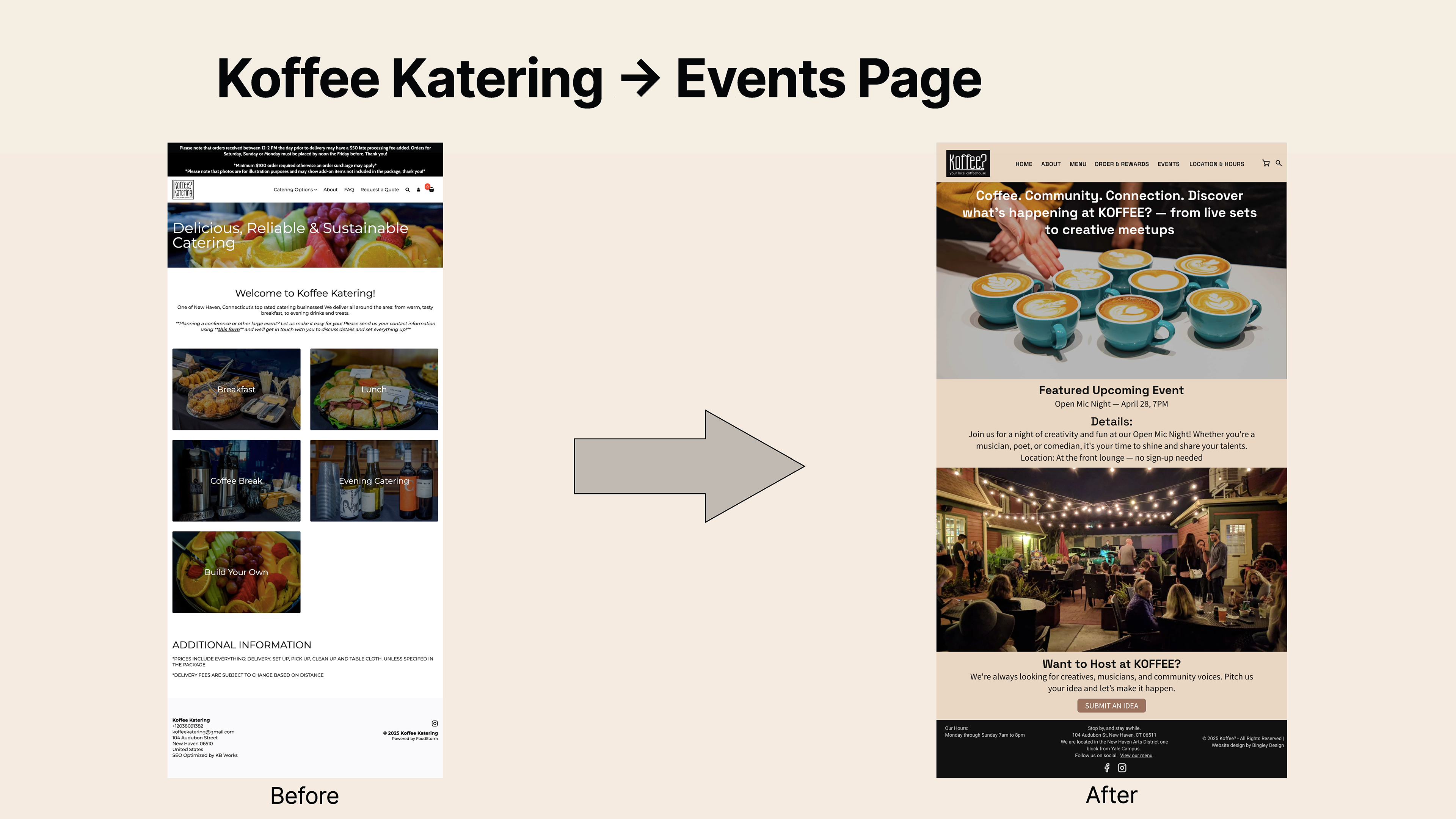
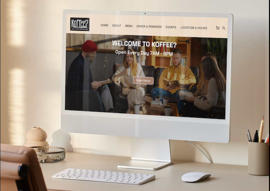
Before: The layout lacked hierarchy and visual warmth. After: Introduced a welcoming hero image, simplified navigation, and featured items to create a more inviting user experience.
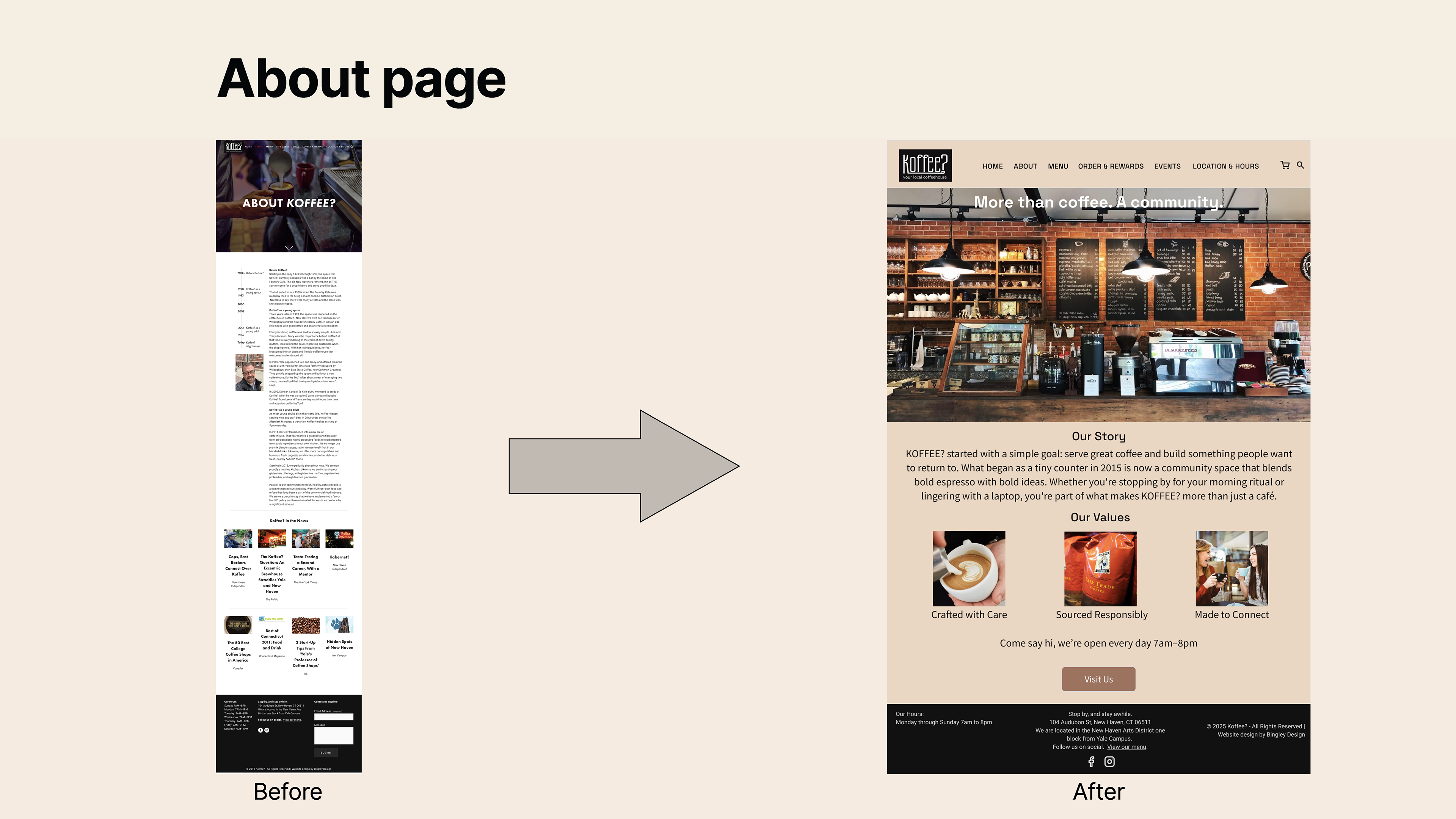
Before: Text-heavy layout with limited visual engagement. After: Improved spacing, added imagery, and refined typography for better readability and storytelling.
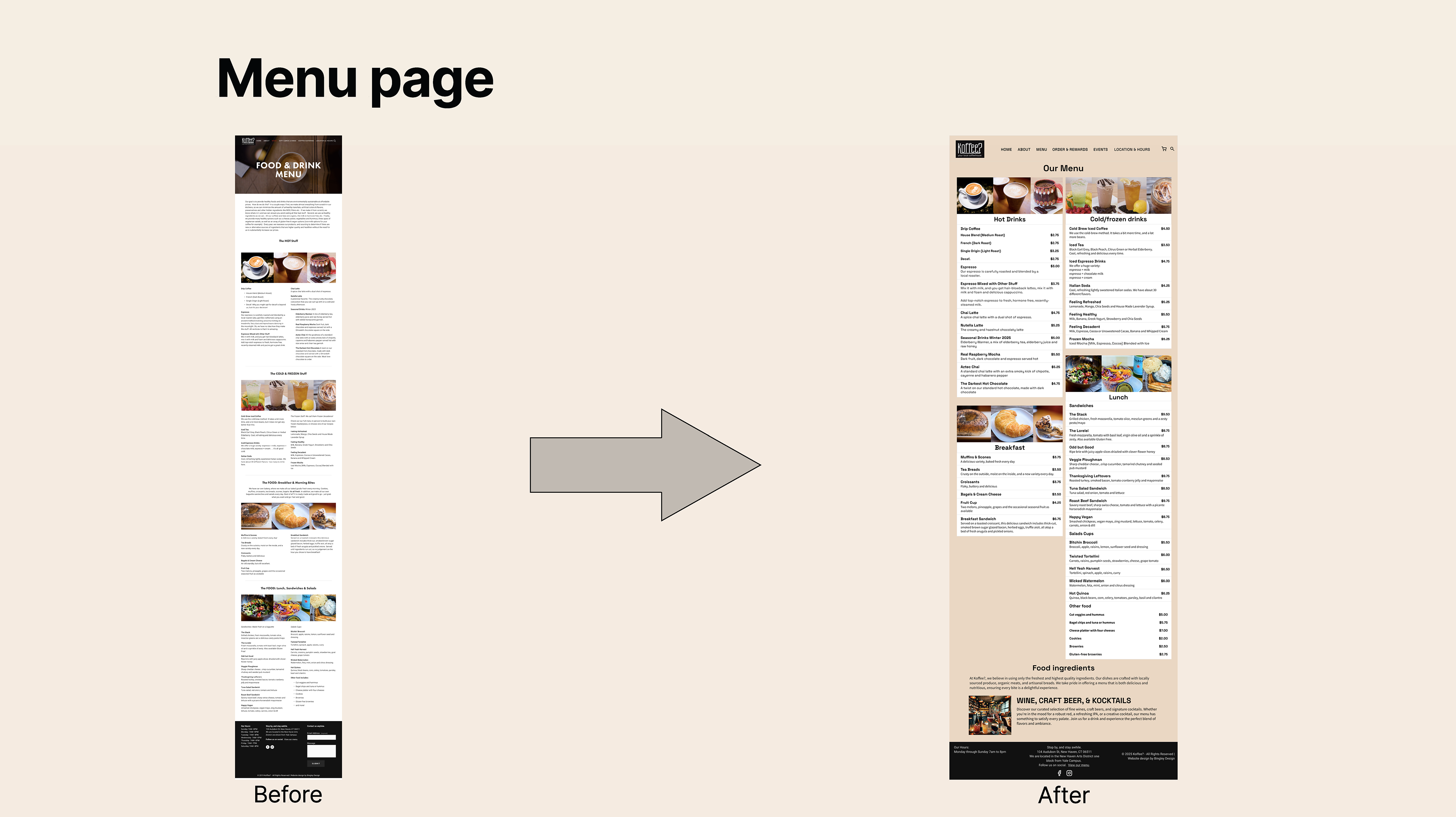
Before: Long scroll and inconsistent spacing made browsing difficult. After: Organized categories, added clearer item structure, and improved alignment for easier scanning.
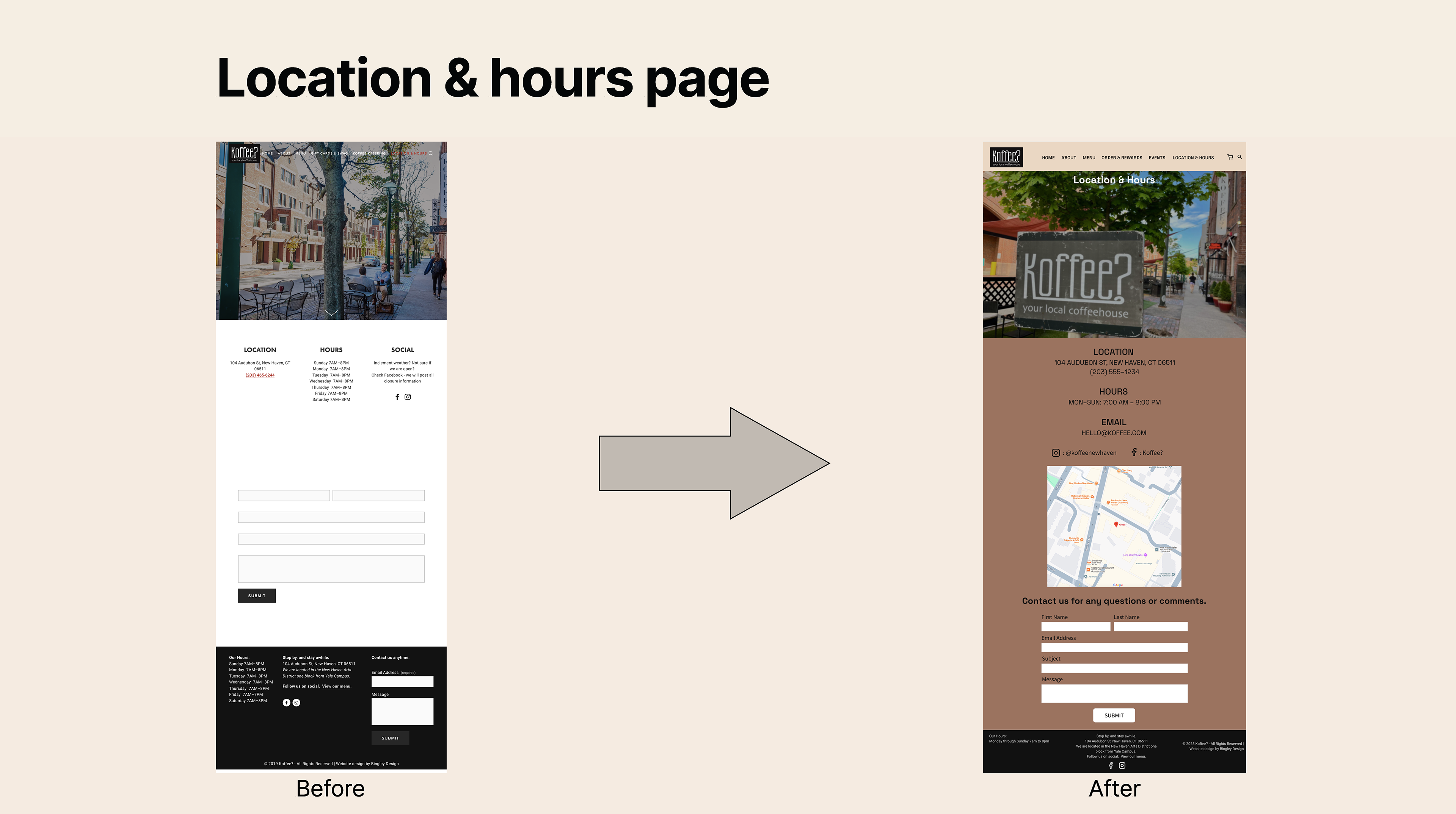
Before: Sparse layout with little visual context. After: Added branded imagery, clearer contact details, and improved form structure for usability.
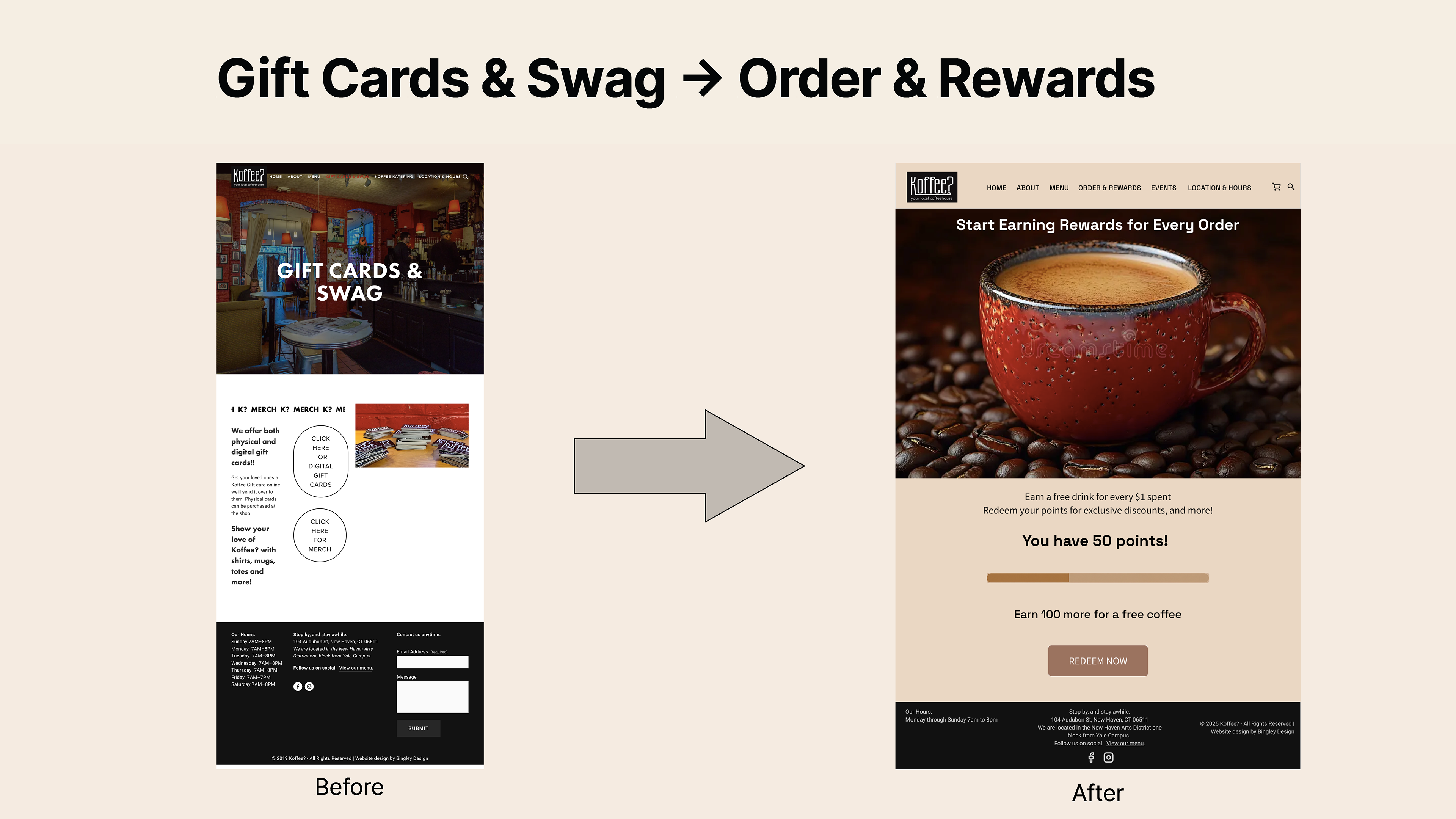
Before: Gift Cards page felt disconnected from user needs and overall navigation. After: Redesigned as a Rewards page with clear calls to action, loyalty details, and stronger visual hierarchy.